Now and then I come across an app (desktop, web or mobile) which, for some reason or another, stands out to me.
It might be an original idea, a feature or detail that's particularly well implemented. It might simply be the wording on the landing page that resonates.
Either way, here are 3 products that I have recently found (and, in some cases, paid for with my own cash) which I think are share-worthy.
I hope you enjoy these mini-reviews.
Bubble
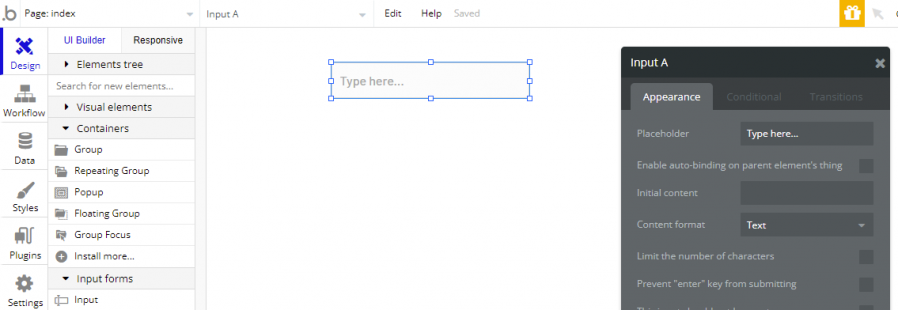
As a professional developer Bubble is the first no-code platform that has scared me. In my opinion it's the first platform which shows that what I do for a living - something which currently requires a relatively high level of expertise - might soon be 'do-able' by anyone.
In general this is a good thing, but I can't help feeling like an accountant who just discovered spreadsheets in the 80's and sees their job being made redundant.
I've kept an eye on the no-code space for a few years but have always been underwhelmed by the what's on offer. It's been a case of either "So limited you'll end up coding it yourself in Visual Studio" or "So complex to use you may as well code it yourself in Visual Studio".
Bubble is different.

Bubble delivers the right level of sophistication to gently onboard new developers while at the same time allowing more experienced developers the flexibility and power to develop complex applications with high level components such as addressing, mapping and built in authentication, and anything that can't be built directly can be implemented traditionally via API's or other integrations.
As a developer I can just focus on the app and not have to worry about nonsense like dependency injection, page life-cycles, data management and other non-functional clutter.
Why you should check it out: Bubble won't be able to make every app, but it's the one that's furthest down the road to creating market-viable apps without feeling like you need a degree in computer science just to run Hello World.
Testimonial.to
Companies have been using testimonials since dinosaurs ruled the Earth. They are a well established marketing tool used to prove confidence in your product to new customers.
In most cases they simply take the form of a few text boxes in your home page, maybe with a headshot of the author. I mean, they... work... sort of...!?
The problem with traditional testimonials is they simply aren't that believable. We've all grown 'screen-blind' to them and, frankly, I consider most of them to be fake since they can be created so easily.
Enter Testimonial.to - the easiest way to create engaging video testimonials for your website, letting you show videos of real customers raving about your product.

Here's how it works.
As the site owner you simply point your customers to your Testimonial landing page so they can record their video right from their browser or device.
You then manage your testimonials with an easy-to-use dashboard, embed them into your website with a single line of javascript, or even build a "Wall of Love" showing all your testimonials in one place.
I've been following Testimonial's progress since the start of the year and it's creator Damon Chen has done a fantastic job of evolving the site to the point of getting some very high-profile clients on board, as well as early investment.
Why you should check it out: Regular testimonials are a well established tool in trad-marketing, but just don't work well online due to their crusty, uninspiring format. Testimonial.to upends the format by using videos of real customers raving about your product or service, which is fundamentally way more engaging.
Reform
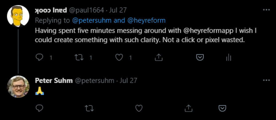
"Why the hell do we need Yet Another Forms App in 2021?" was my first remark when I learned about Reform.
And then I used it.

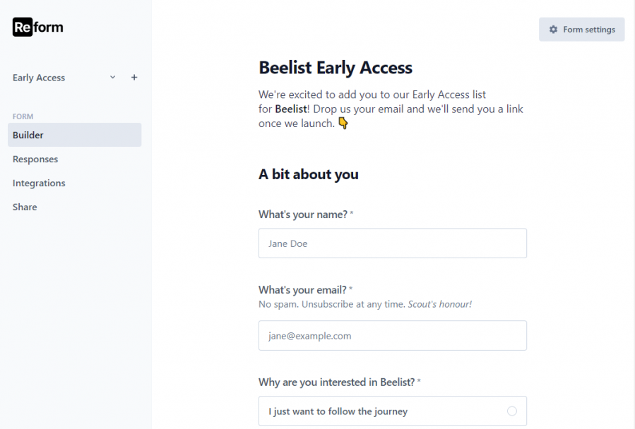
Reform is clearly in early stage development since there are very few features beyond the basics at this point. But that's a good thing.
Let me tell you why.
In short, it means there are virtually no distractions.
It's hard to waste time fiddling with fine details or styling.
It's impossible to screw things up. Just get in, make your form and get out.

All of the basics are present and correct and very well designed.
The builder has a dozen or so different input types. The responses page has a single button to download your data. Integrations are limited to webhooks (the bare minimum to get it working with Zapier) and the share page is simply two code snippets to link or embed your page.
Simple, beautiful, clean. I hope it stays this way forever.
I think the "scarcity of options" is a positive thing and the lack of "screen furniture" is liberating compared to the other types of forms apps. I can't wait to see how it develops over time.
Why you should check it out: Form products have been around forever and most are outdated and overly complex. Reform has started over, taken the best bits, ignored the gimmicks, and packaged it up into an enjoyable yet deceptively powerful product.
Summing up
A common thread between these three products, which I hadn't noticed until now, is that they are all iterations on previous attempts (trad-development -> Bubble, testimonials no one believes -> Testimonial.to, Tacky TypeForm -> Reform).
It shows there are opportunities in recycling/upcycling existing ideas and it really proves the old saying "what's old is new again".
I hope you enjoyed these quick mini-reviews. Follow me on Twitter for more!


